The Graphing Pane
The graph is plotted as soon as the sweep (or independent) variables are specified in the model pane.
With the X‑axis log and Y‑axis log buttons at the top of the pane,
or the menu entries View > Toggle X‑scale (⌥⌘X) and View > Toggle Y‑scale (⌥⌘Y),
the scaling of the axes can be toggled between linear or logarithmic.
The graph is then limited to positive values only.
To zoom-in on the graph, select a section of the graph with the cursor by clicking and dragging.
This selects a section of the x-axis, while the y-axis is scaled automatically to show all the data within that selection.
The zoom-in is limited by the number of steps of the x-axis variable as set in the model pane, down to a minimum of a single interval.
For a logarithmic x-axis, the interval distribution of the sweep variable should also be set to logarithmic in the model pane.
Zooming only works within the range of the sweep variable set in the model pane.
To zoom-out to full-scale, double-click in the graph or View > Zoom Full (⌥⌘-).
When zoomed in, panning is initiated by a click-and-hold (long press on the iPad). A hand cursor will appear (on the Mac) and the whole graphing area is selected. The graph can then be panned along the x-axis by dragging the cursor. The y-axis is automatically scaled while dragging.
Zooming and Panning can also be done with the keyboard.
The commands are also located under the View menu with their keyboard shortcuts:
Zoom In (⌘+), Zoom Out (⌘-), Zoom Full (⌥⌘-),
Pan Left (⌘◀︎), and Pan Left (⌘▶︎).
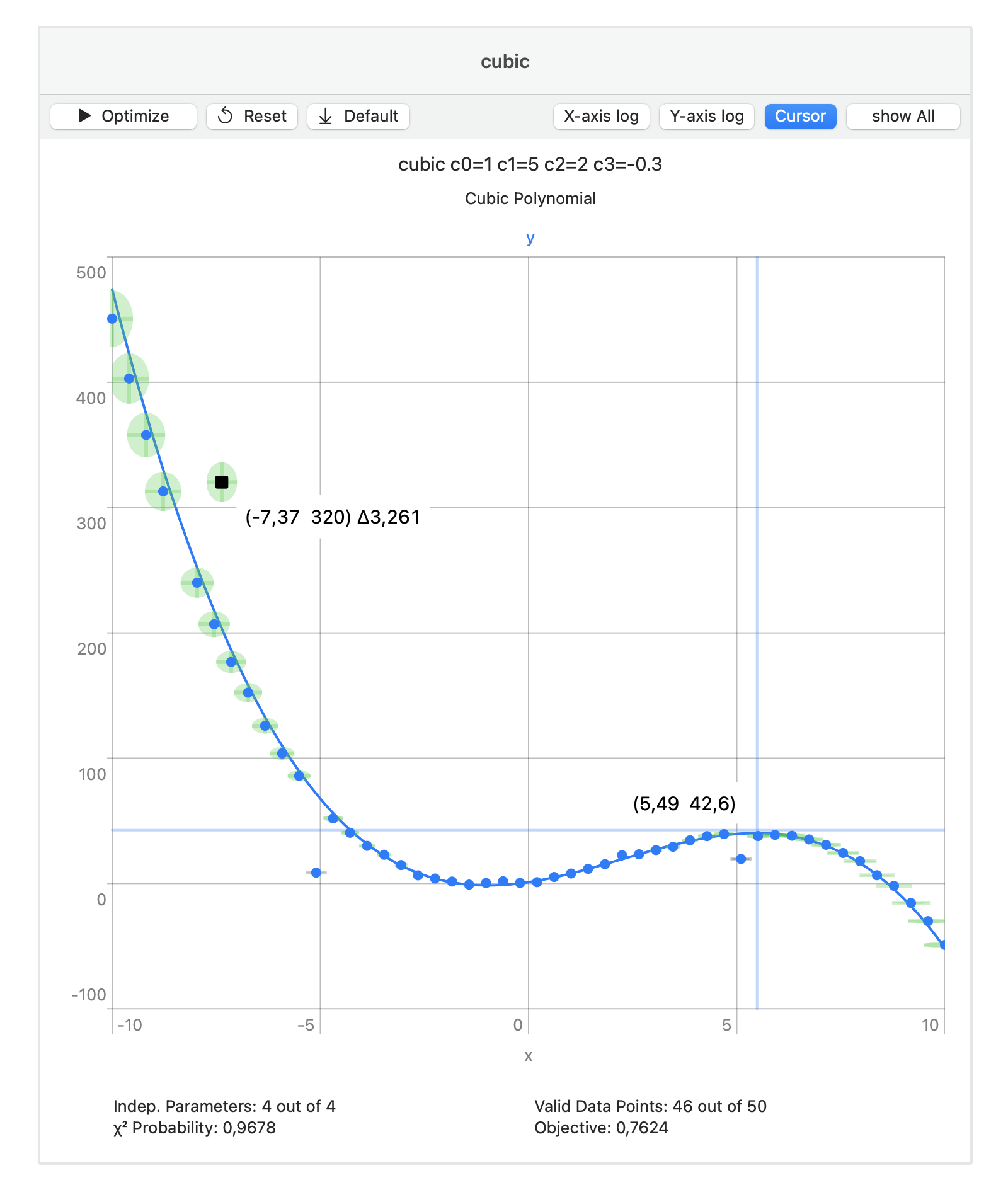
By clicking on (or near) a data point its coordinates are displayed on the graph, including its distance to the model curve. The data point is deselected by clicking on it again. Multiple data points can be selected simultaneously. All data points are deselected by a single click on the graph outside the range of any data points. (The selection range of a data point is approximately ten percent of the current plot area.)
A cursor can be toggled on or off with the Cursor button at the top of the pane,
or with the menu entry View > Toggle Cursor (⌥⌘C).
The graph is automatically updated when the model variable ranges or parameter values are changed. When using the parameter slider to change the parameter value, the model curve(s) and the axes will be animated to show the effect.
Below the graph, the Objective field displays a measure of
the average distance between the collection of data points and the current model curve(s),
that is, the model with the current values for the parameters.
Before optimization the Valid Data Points field displays the number of data points
for which the distance to the curve could be calculated.
(The distance calculation might fail for data points close to the extrema of the model curves.)
After optimization, the number of identified outliers is subtracted.
Before and after optimization, the data points can be grouped and filtered for quick inspection.
The show button toggles between show All, show Valid and show Invalid.
Its main application is after optimization to quickly identify the validity range of the model:
the eliminated data points are marked as invalid, while the remaining data points are marked as valid.
Before optimization, it marks as valid all the data points with a residual below one,
and as invalid all data points where the distance calculation failed.